2021
Elastic in Collaboration with HBOMax
and Sophia Nahli Allison
Art Direction / Title Design / Packaging Design
Hallowed Ground
This HBO documentary pays tribute to Henry Hampton's masterpiece ‘Eyes on the Prize.’ It revives ancestral memories, sparks imagination, and delves into the journey for Black liberation. The voices of the movement, including modern activists, academics, and artists, offer firsthand insights into both recent and distant history.
The documentary's visual style prompts a deep introspection into the retelling of Black ancestral stories for liberation, captured through Sophia Nahli Allison's lens. I took pride in developing a visual and typographic system that matches the documentary's elevated yet grounded style.
Title Treament
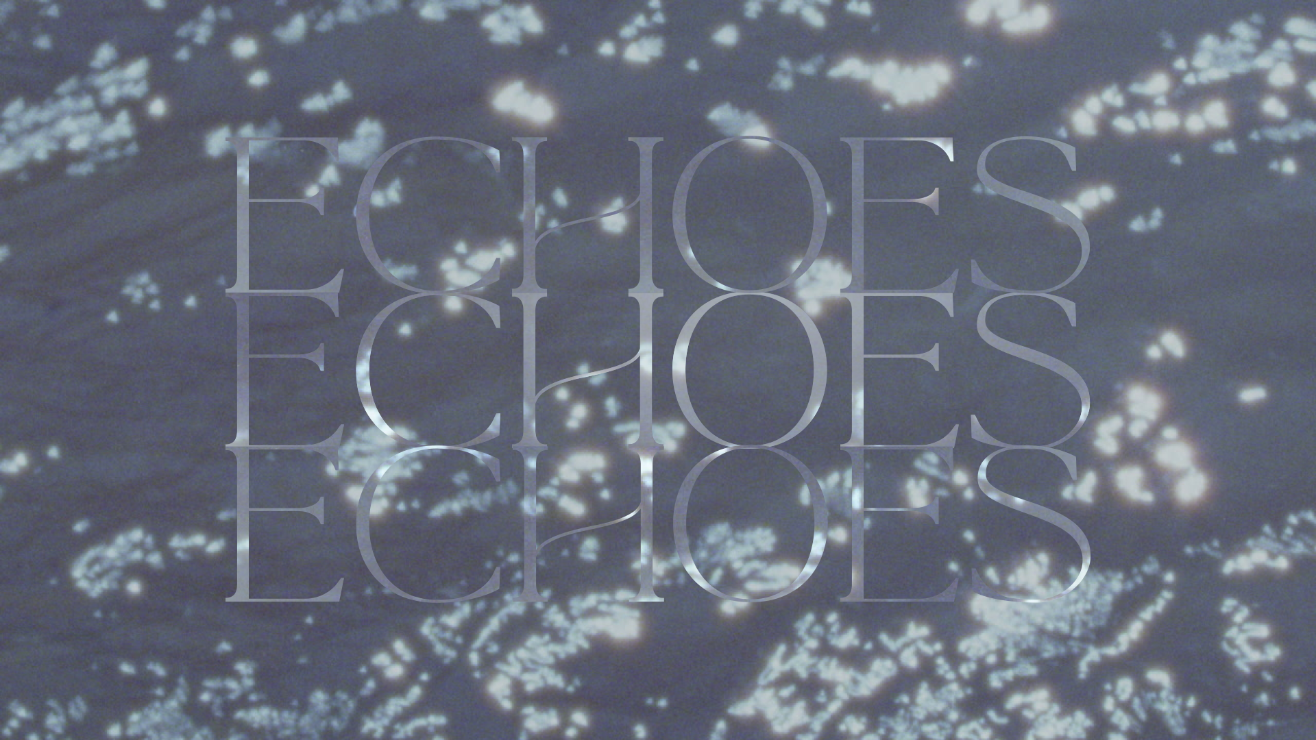
I explored a number of variations of the title treatment design which ultimately influenced the final title design. Heidi Berg photographed our main titles multiple times refracting through glass prisms as individual stills — which when sequenced together feel like a temporal fever dream of light and refractions. This introduced a whimsy and tone that visually permeated the rest of the documentary graphically and through art direction.
Raw Exploration
Final Product


The delicate balance of rooting the visuals in something familiar whilst still making them feel fresh was a wonderful challenge to accept.
“We tried to create a look you don’t expect from lower thirds,” Jordan added. “I don’t think we would have treated it the same way 10 years ago, but that’s the cool part about it. We still have the same respect for the footage and the subject matter, but translating our thoughts to a current time was necessary to compliment Sophia’s perspective, which isn’t rooted in tragedy, it’s very deep and contextual, but it also feels like a new lens on these issues, which extends the audience to so many different people. I think the type system does that as well.”
— Jordan Lyle


THOUGHTS AS A BLACK DESIGNER
“For me as a Black person, I connected to the material instantly because it reflects my experience in America. All the things that happened in the past are still happening in the present day, so we wanted the design style to transition between and reflect different time periods. We wanted it to have an ethereal but grounded quality to it, to look super artistic and creative like a fairy brush was painted over some pretty heavy subject matter.”


