2023
Showtime
Creative Lead / Creative Strategy / Packaging Design / DOOH
THE ASK
Producing the sixth season of any TV show is a significant accomplishment, and The Chi has cemented itself as a beloved series that celebrates Black stories and experiences. In order to promote this season, Lena Waithe, the creator of the series, wanted the campaign to create space for the entire cast to be seen in a unique way, unlike anything we’ve seen in the show’s marketing before.
Our Streets.
THE SOLUTION
Capturing our talented actors in a striking black-and-white, photojournalistic, caught-moment style became the visual theme that ran consistently throughout all the advertising materials. Punchy animation, bold typography, and even bolder accent colors made the body of the rest of the visual package easily identifiable and a contemporary evolution of the visual styles of past campaigns.
Our Way.
Photojournalistic / Real / Warm & Welcoming / Organic / Simple not Sterile / Bold / Graphic / Uncomplicated
Authentic / Type-Driven / Image Supported / Elevated
Modern / Layered / Rhythmic / Flavor / Energetic / Swag
DRAMATIC
ELECTRIC
COOL
Type + Animation
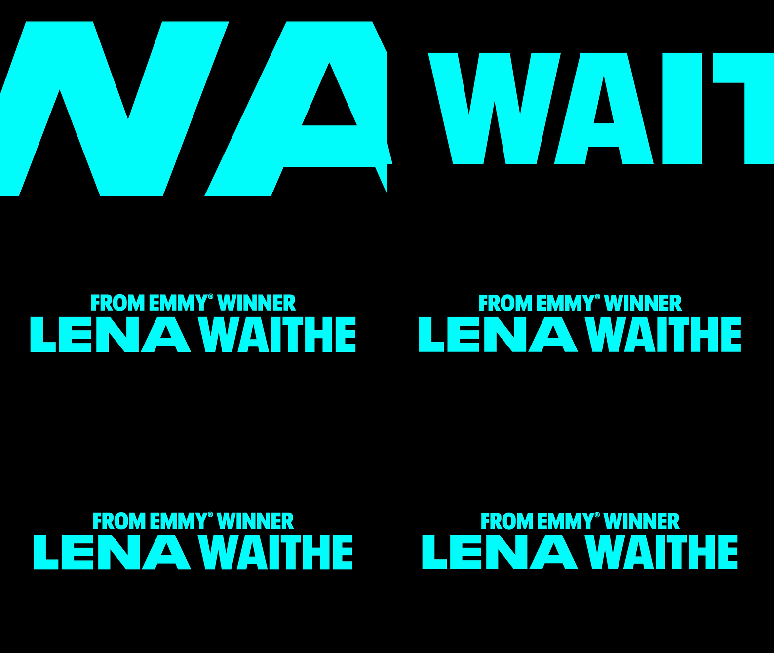
The typography style and animation we developed accompany and compliment the storytelling of our lively editorial content. A staccato animation style introduces a touch of rawness and imperfection, emphasizing the human element. Variable-type animation always seems to add that element of visual texture and unpredictability without having to try too hard to accomplish. It’s just enough sauce to add some depth and dimension and trim the digital edge of perfectly smooth typography.
Check out the trailer below
DIGITAL OUT-OF-HOME
Our Streets. Our Way.
We know the importance of capturing the public's attention in the moment on the street. So, we took our striking black-and-white artwork and brought it to life in a simple parallax motion piece for digital billboards - using all the visual ingredients of our package in the recipe.
Everyday People x The Chi
EXPERIENTIAL


