
2023

Showtime
Art Direction / Creative Strategy / Motion Packaging Design / DOOH
Recognition


THE ASK
As ravenous and smart as Yellowjackets fans are, we knew our visual direction for this season's packaging had to hint just enough without saying much of anything? How do we match the buzz for S2 with a show package that's fresh but still but still unmistakably Yellowjackets.
We hear the wilderness.
THE SOLUTION
We paid close attention to the imagery, mythology, and symbolism the show is jam-packed with. Fans are rabid to infer anything they can decipher and get ahold of to piece together clues about the show. So why keep it from them? This was an opportunity to bring the darkness into the real world in a fun, “tangible” way.
And it hears us.


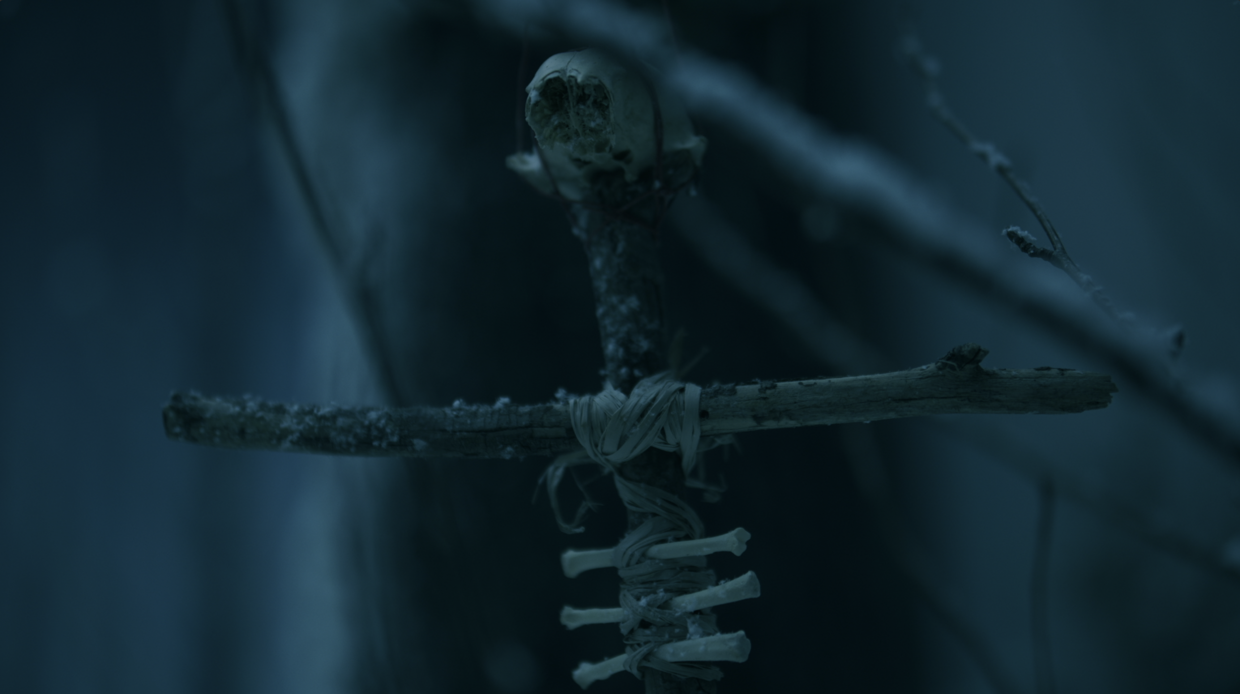


Season 2 “Mythos” — From Props to Package
We honored Yellowjackets' rich symbolism by going straight to the source. Using the show's actual props, we scanned and digitally recreated them with photogrammetry. This gave us a library of authentic 3D models, preserving every texture and detail. It's how we kept true to the show's DNA while evolving the visuals for season 2.
We picked a simple yet versatile type combo that works across all Yellowjackets platforms - from social media to billboards. Our primary font had to have edge (buzz buzz 🐝) while balancing the show's mix of horror and varsity nostalgia. It complements the iconic yellow title treatment, giving us flexibility without losing the brand's bite.
Typography


DIGITAL OUT-OF-HOME
Citizen Detectives
Needless to say, the packaging did exactly what we intended and had hoped for. The hive took our loose (but very thoughtful) suggestions and delved deeper into the woods — pairing the psyches, storylines, and theories of each of the characters and the symbology used for each of their backplates.
Cosigned by the official r/Yellowjackets reddit - see the thread here.
-
Creative Director – Heidi Berg
Art Director – Jordan Lyle
Producer – Rosanne Raposo
Design — Justin Acree / Sam Cividanis / Jordan Lyle
Animation – Justing Acree / Daniel Ginzburg / Sam Cividanis